Case Study
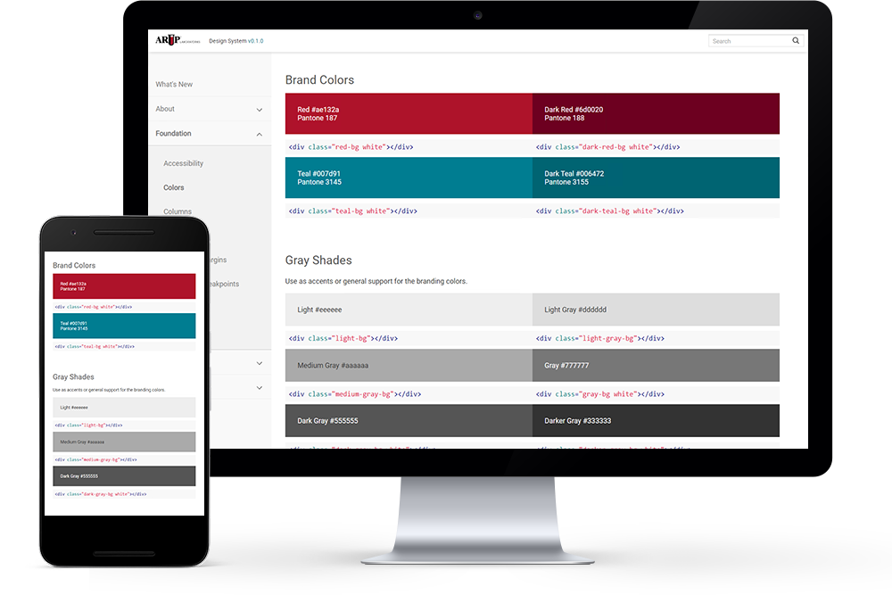
Created design system to unify ARUP’s brand using accessibility standards and design thinking. Positive outcomes of the design system release:
✓
Decreased development time by over 20%
✓
Better standardization and integration between web properties
✓
Improved usability and product quality
Project Overview
Challenges
ARUP Laboratories had numerous teams working on different products. This caused repeat development on similar product components, resulting in slow development and inconsistencies in delivered products.
Roles
→
User research and testing
→
Design workshops and reviews
→
Low and high fidelity prototypes
→
CSS, HTML, and JavaScript
→
Drupal theming and development
Solutions
I collaborated with product managers, developers, and other designers to create reusable code, common design patterns, and a shared visual language. I built and scaled the design system from 0 to 1, and I evangelized its adoption.
Design Process
Discover
- Conduct user research
- Background, market and competitor research
- Advocate for the users

Define
- Gather requirements
- Define scope
- Project timelines, technical feasibility

Design
- Sketch wireframes
- Low to mid fidelity prototypes
- High fidelity prototypes

Test
- Test for usability
- Gather qualitative and quantitative data
- Create design iterations

Deliver
- Handoff to developers
- Document design decisions
- Monitor outcomes

Discover
As a founding member of the ARUP Design System team, I performed user interviews and surveys to better understand how the product would be used by internal developers and designers. The design and engineering teams gave insights on how a unified and branded design system would help them work more quickly and efficiently.
Methods
→
User interviews and surveys: meetings and focus groups
→
Web analytics: Google Analytics
→
A/B testing: Google Optimize
→
Heatmaps and screen recordings: CrazyEgg and Microsoft Clarity
Previous styles and competitor research
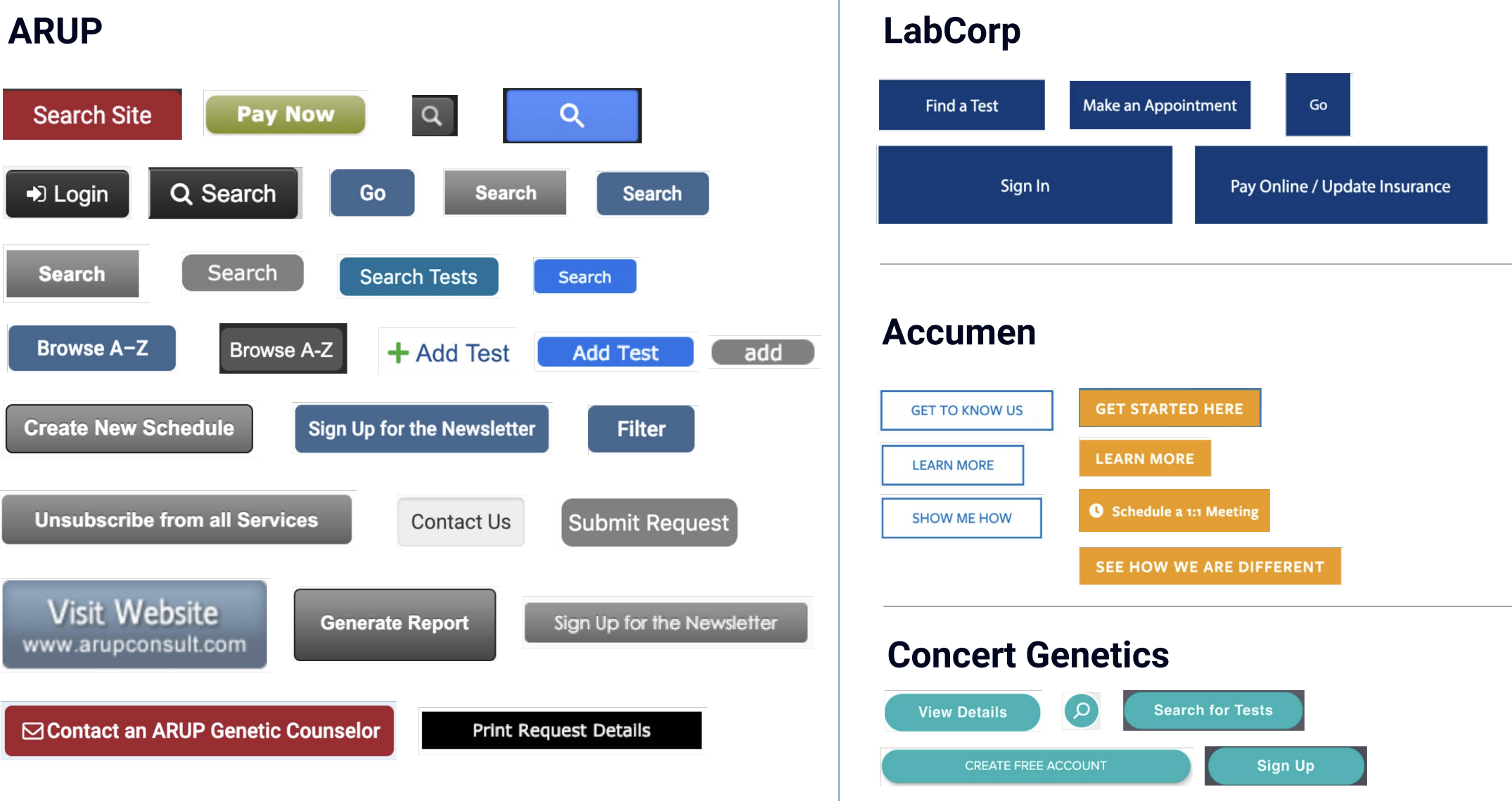
Previously, ARUP’s customers were struggling with confusing visual styles, different branding colors, and inconsistent interaction patterns. For example, the gray background color used for action buttons were often confused with the disabled state. Compared to the company’s competitors in the healthcare space, ARUP’s products were more difficult to use.

Define
Who are the users of the design system?
I prioritized user needs throughout the design system’s development and delivery process:
→
Marketing: branding styles with colors, typography, and brand identity
→
UX teams: standardized specifications that are consistent but also flexible
→
Engineering: reusable components with pre-built code and interactions
Design System Team
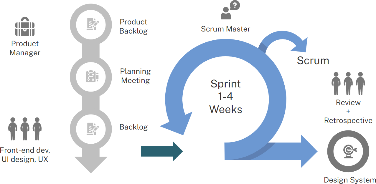
The design system team consisted of myself, 2 other UX/UI designers, 2 developers from the customer experience product team, a technical product manager, and a scrum master. The team used an iterative agile process to work on the design system components, with sprints lasting between 1 to 4 weeks. The team also regularly reported progress on the design system to director and executive level stakeholders.

Design
I prioritized user needs throughout the design system’s development and delivery process:
→
Marketing: branding styles with colors, typography, and brand identity
→
UX teams: standardized specifications that are consistent but also flexible
→
Engineering: reusable components with pre-built code and interactions
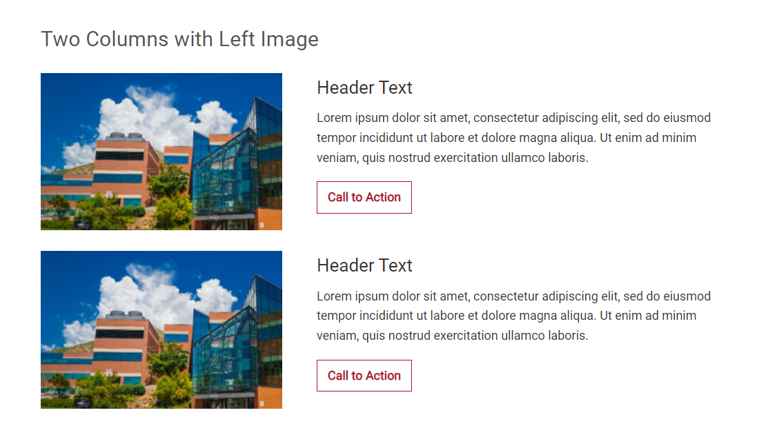
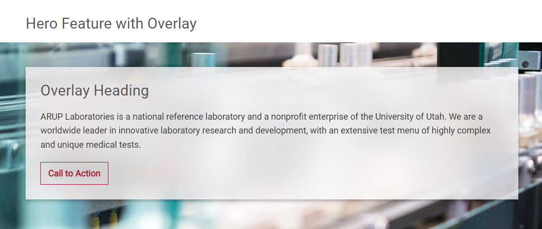
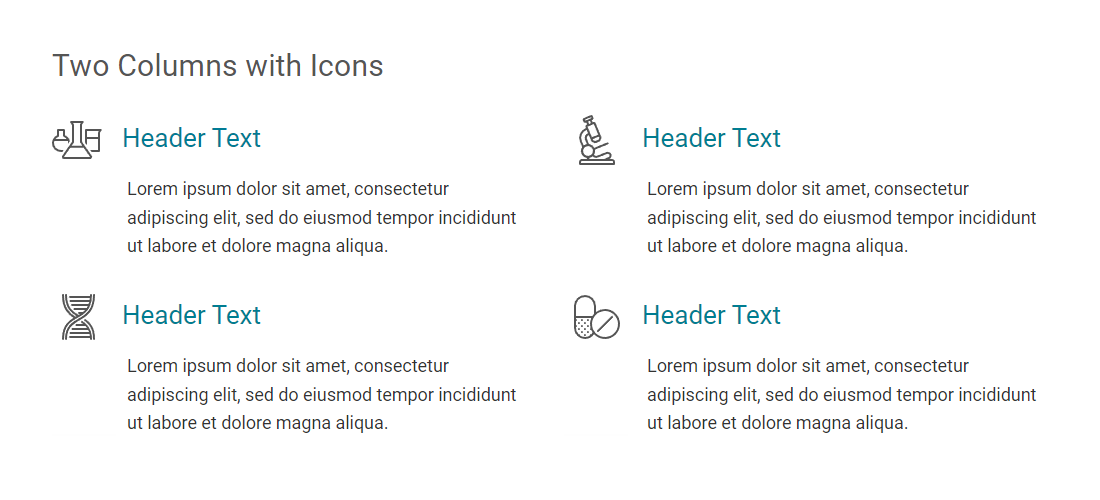
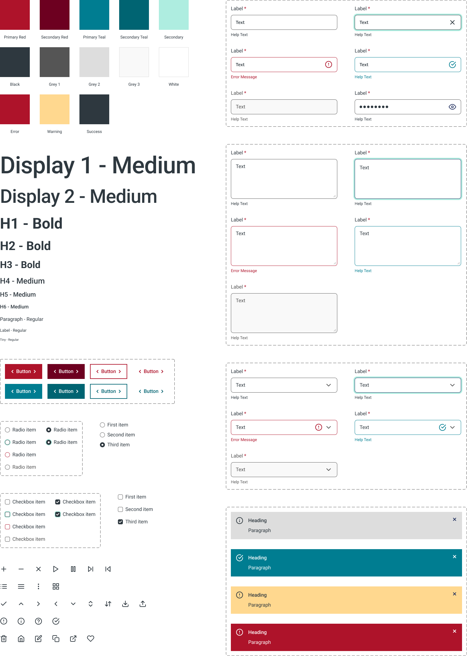
I referenced ARUP’s redesigned website in creating components for the ARUP Design System to reflect the company’s existing brand while evolving designs for web and mobile products.

Accessibility
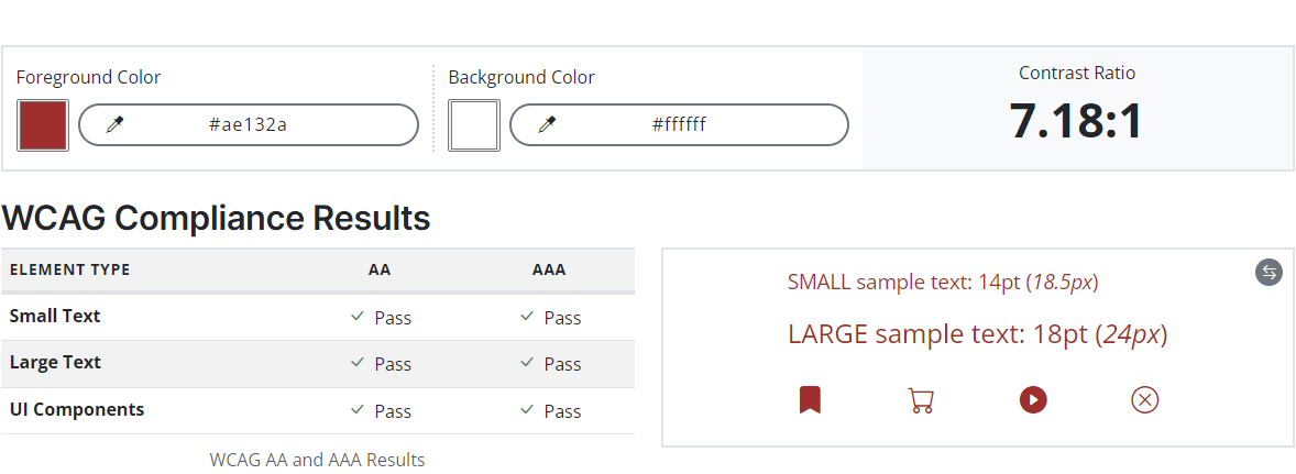
I designed according to Web Content Accessibility Guidelines, conducting accessibility checks on colors to ensure compliance. This is an example of the corporate brand color red on a white background.

Test and Optimize
I set up and performed A/B testing in the Google Optimize platform to see whether teal buttons or red buttons perform better for click-through conversion rates. The call-to-action button was located on the careers section of the website, where prospective job seekers can click on the button to see open positions.
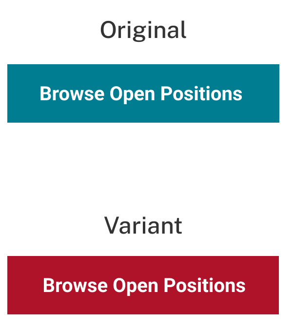
The teal button was the original version, and the red button is the variant. Each experiment ran for over a thousand sessions in Google Optimize.
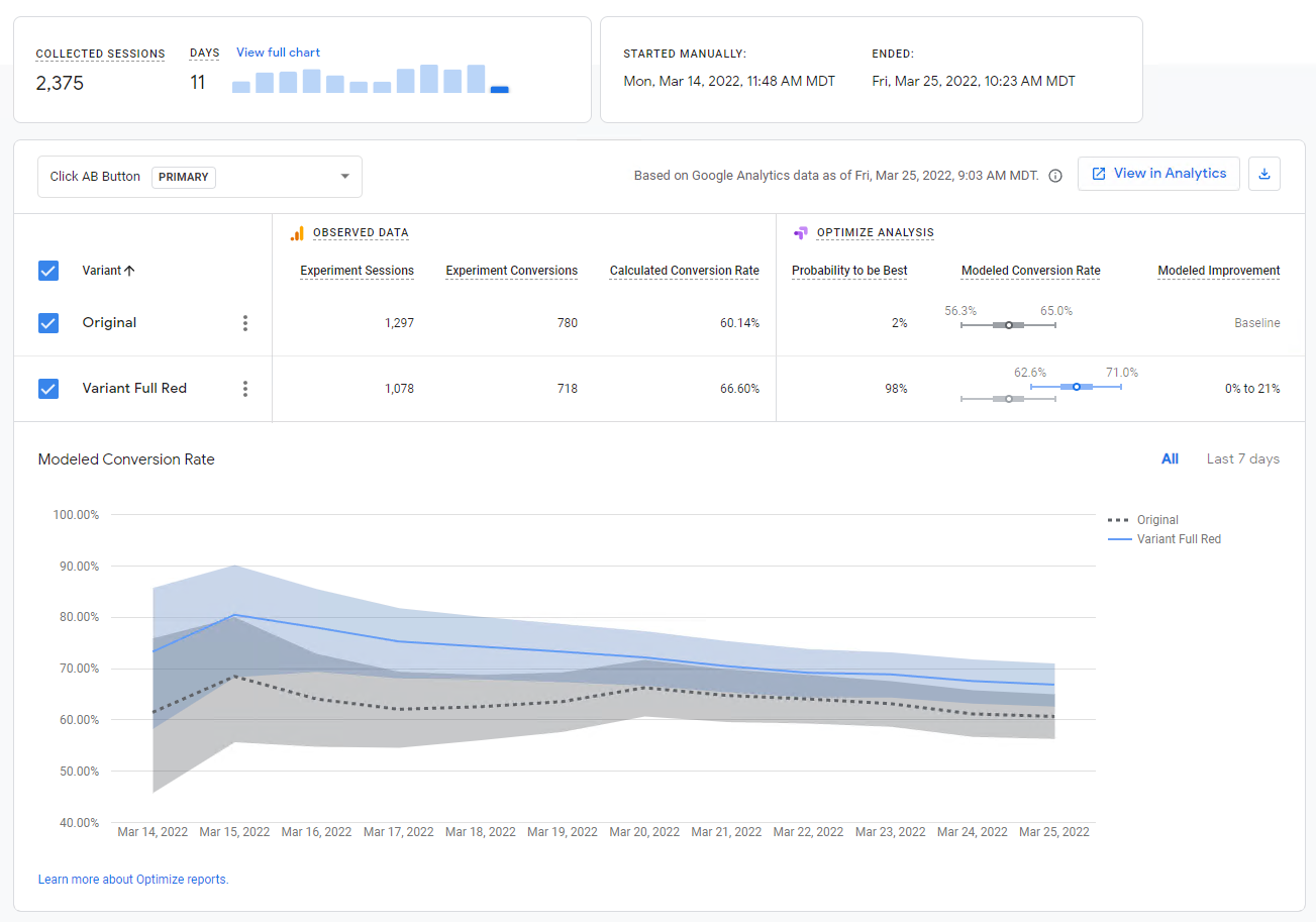
The observed data shows that the red button outperformed the teal button by about 6%. According to the statistical analysis, there is a 98% probability that the red variant is better. I reported the results to the design system team, and the data was used to inform design decisions.
Design Handoff
Throughout the design process, I worked with other designers and developers to smoothly transition designs into functioning code. My proficiency in HTML, CSS, and JavaScript allow me to seamlessly bridge the gap between design and front-end development.
I speak the language of both designers and developers, and I seek to make everyone feel heard and understood, supporting the entire team to create the best overall product.

Delivery and Outcomes
The project is complete, with the design system released and in production as of 2022. Developers reported that the design system helped them deploy faster with less time spent on programming specific components. Positive outcomes of the design system release:
✓
Decreased development time by over 20%
✓
More consistent visual standardization between products
✓
Improved usability and product quality