Case Study
Successes of the ARUP Laboratories website redesign:
✓
Increased visual consistency across the entire site
✓
Improved navigation, resulting in 18.9% click through rate increase
✓
14% fewer calls to customer service for website-related issues
Project Overview
Challenges
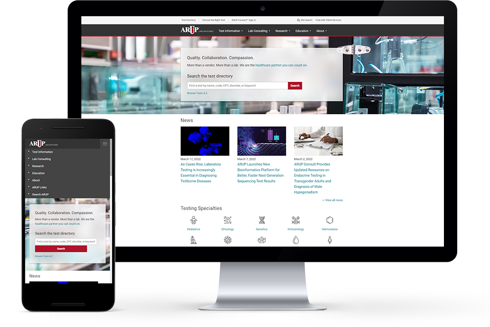
ARUP Laboratories is a medical diagnostics laboratory affiliated with University of Utah and provides reference lab services. The company’s website had inconsistent UX and confusing navigation that hindered sales and marketing efforts.
Roles
→
User research and testing
→
Low and high fidelity prototypes
→
CSS, HTML, and JavaScript
→
Drupal CMS implementation
→
Post-launch analytics
Solutions
I collaborated with stakeholders in marketing, technology, human resources, and executive leadership to understand the goals of the project. I performed research and testing to design and implement an improved experience for customers.
Design Process

Discover
- Conduct user research
- Background, market and competitor research
- Advocate for the users

Define
- Gather requirements
- Define scope
- Project timelines, technical feasibility

Design
- Sketch wireframes
- Low to mid fidelity prototypes
- High fidelity prototypes

Test
- Test for usability
- Gather qualitative and quantitative data
- Create design iterations

Deliver
- Handoff to developers
- Document design decisions
- Monitor outcomes
Discover
I participated in user research to find out what the users do, think, and feel as they go through the website. Many data points were gathered using quantitative analytics, qualitative input from customers, and vision from stakeholders. I considered both user needs and business objectives to create the most valuable and feasible solutions.
Methods
→
User interviews and surveys: meetings, focus groups, and feedback from clients
→
Web analytics: Google Analytics
→
A/B testing: Google Optimize
→
Heatmaps and screen recordings: CrazyEgg and Microsoft Clarity
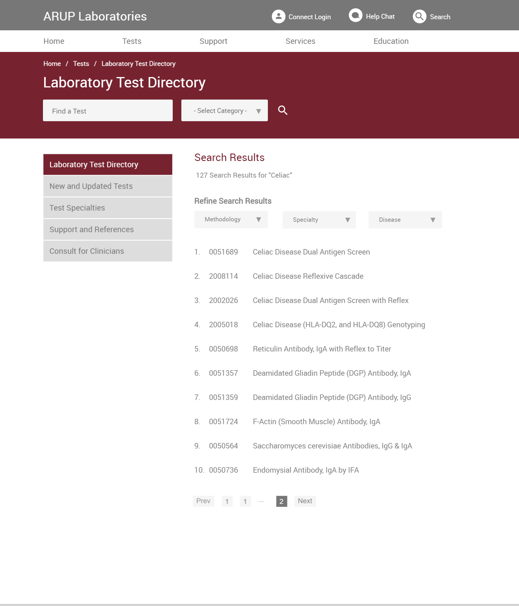
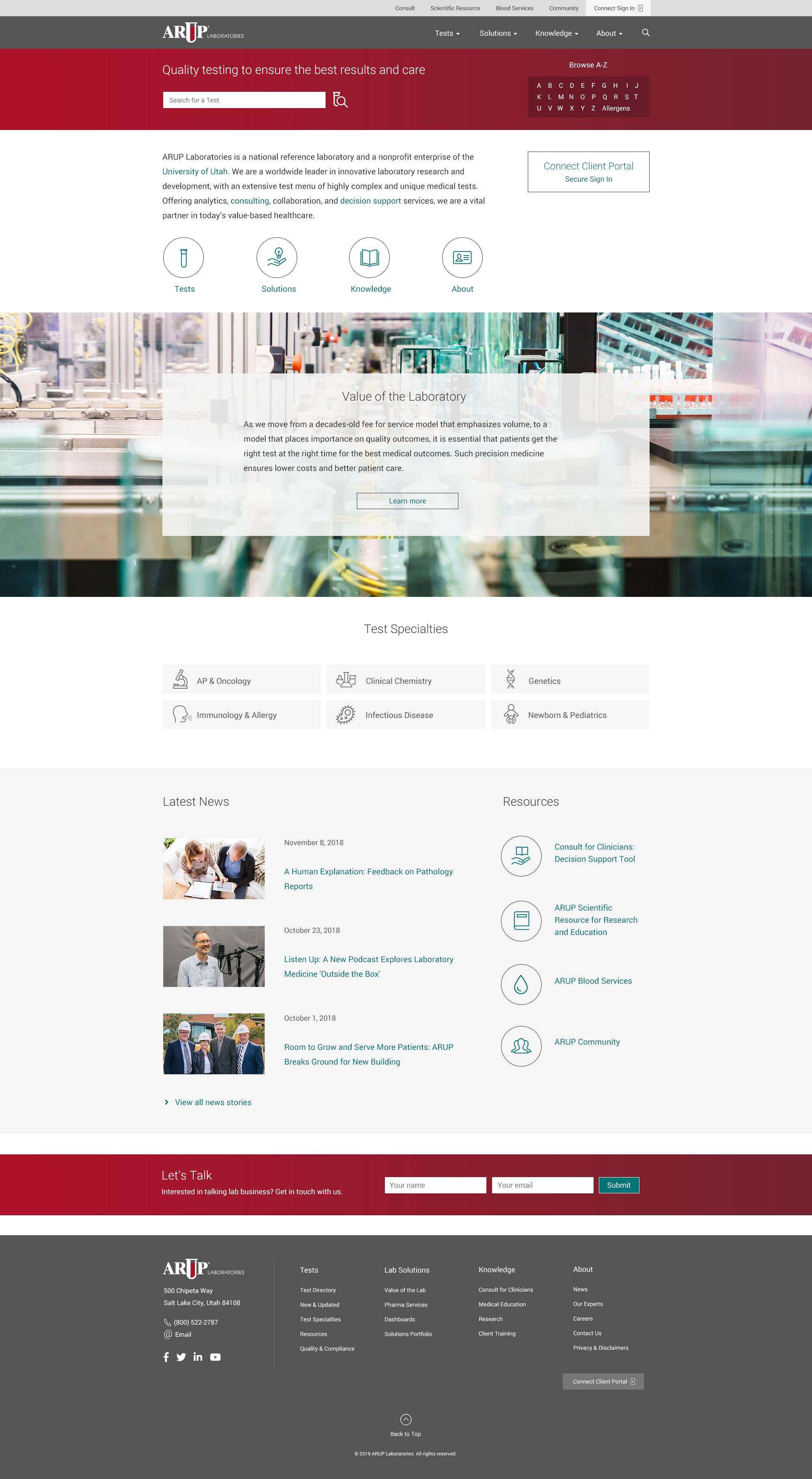
Old Styles
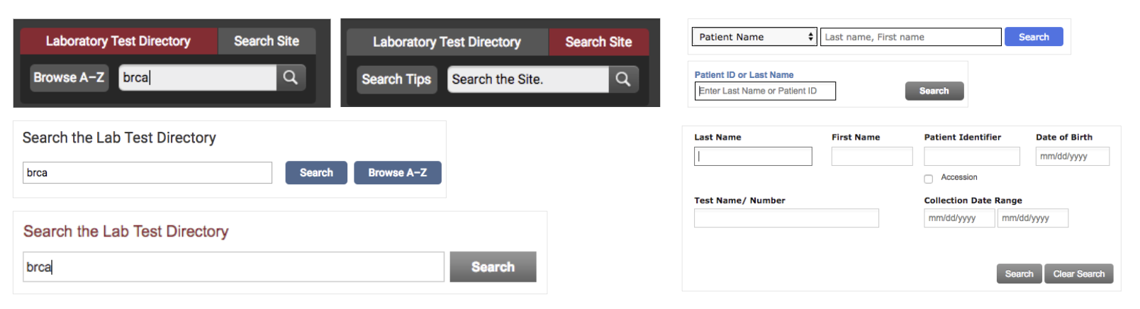
Previously, users were struggling with confusing visual styles, different branding colors, and inconsistent interaction patterns. For example, the gray background color used for action buttons were often confused with the disabled state. Compared to the company’s competitors in the healthcare space, ARUP’s products were more difficult to use.
Define
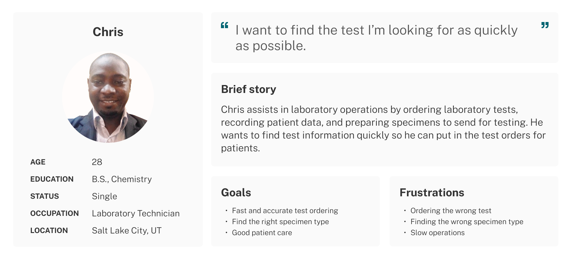
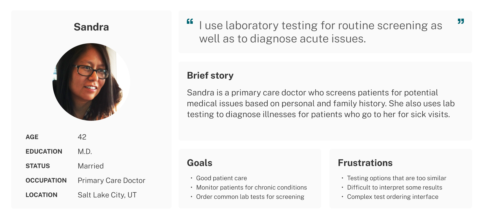
Who are the customers and target audience?
Design
I identified common pain points across different users and found unmet user needs. For example, it was unclear to users in the old experience whether they were searching the laboratory test directory or the website itself. I created design to addresses this and other issues uncovered in user research. The goals for the redesign were:
→
Adhere to new branding styles
→
Create quality and consistency in user experience
→
Improve navigation and wayfinding
→
Improve overall user experience
Accessibility
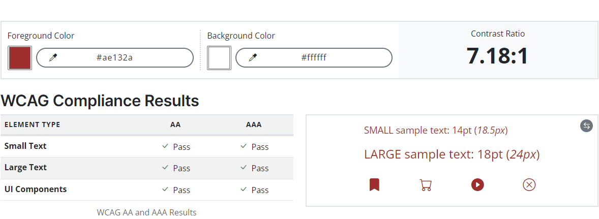
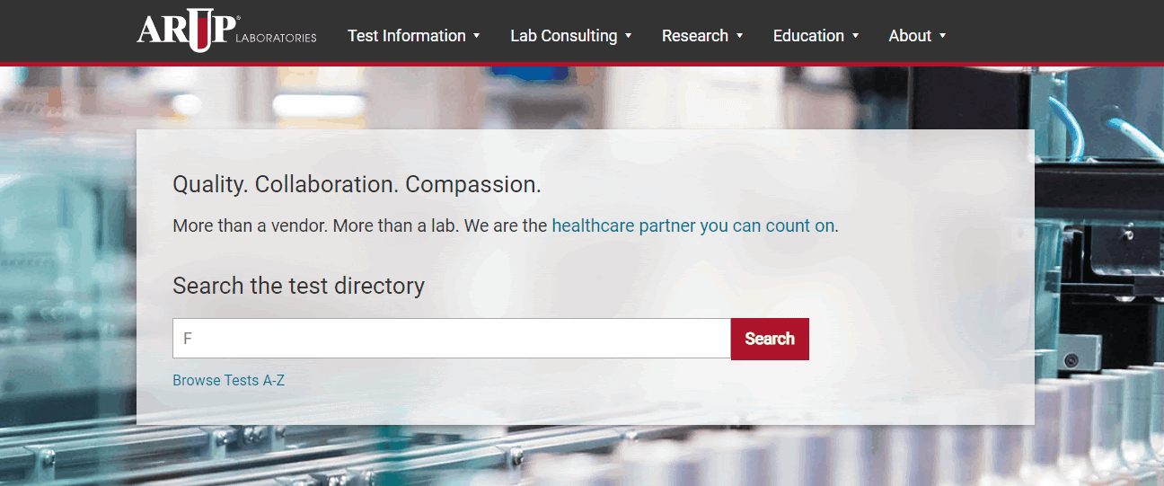
I designed according to Web Content Accessibility Guidelines, conducting accessibility checks on colors to ensure compliance. This is an example of the corporate brand color red on a white background.
Mid fidelity wireframes
I created wireframes that are mid fidelity for users to navigate through the pages and complete tasks during usability testing. I also presented these to stakeholders to receive feedback and design critique.
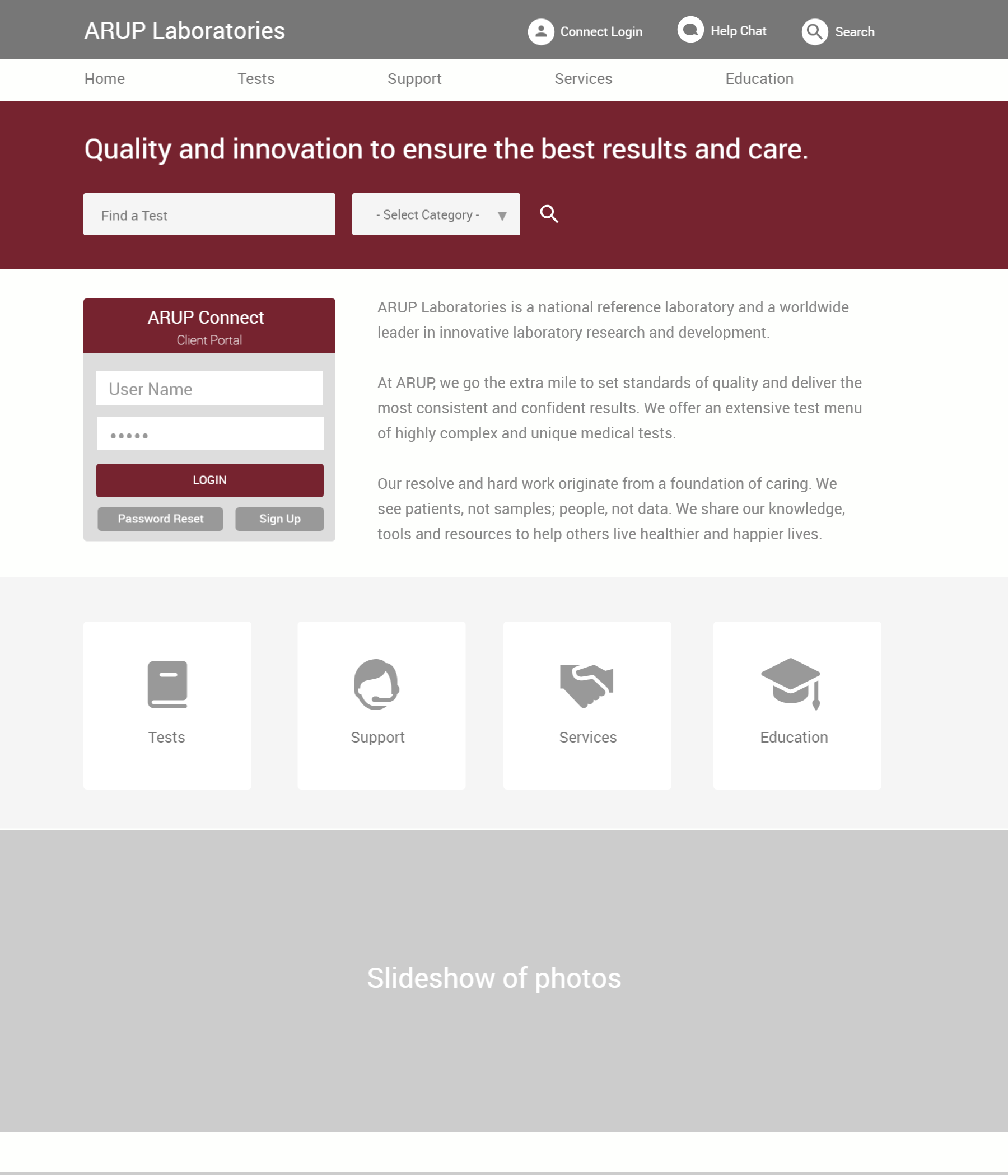
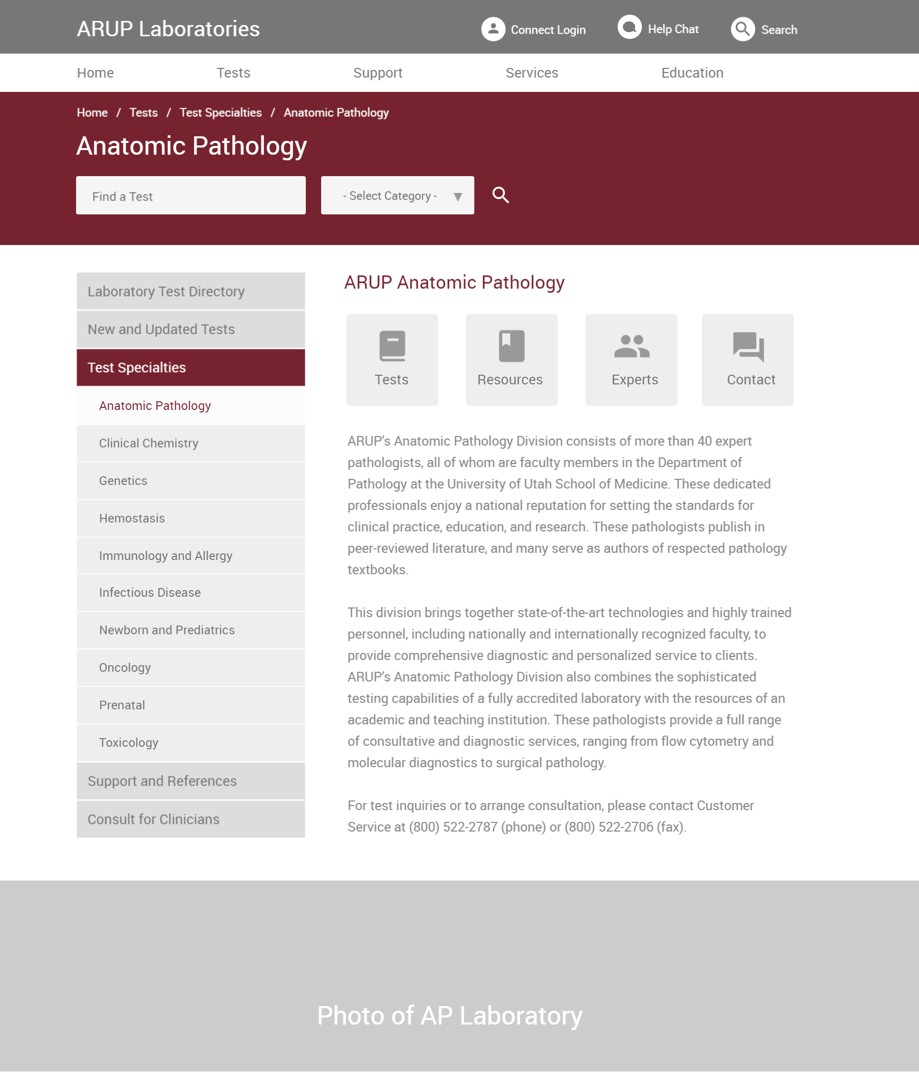
High-Fidelity Prototypes
After testing layouts and information architecture with wireframes, I created high fidelity prototypes. I continued to iterate different designs based on user feedback and testing. My goal was to help customers get what they need done quickly and also to convey a reputation of a trusted laboratory dedicated to patient care.
Test and Optimize
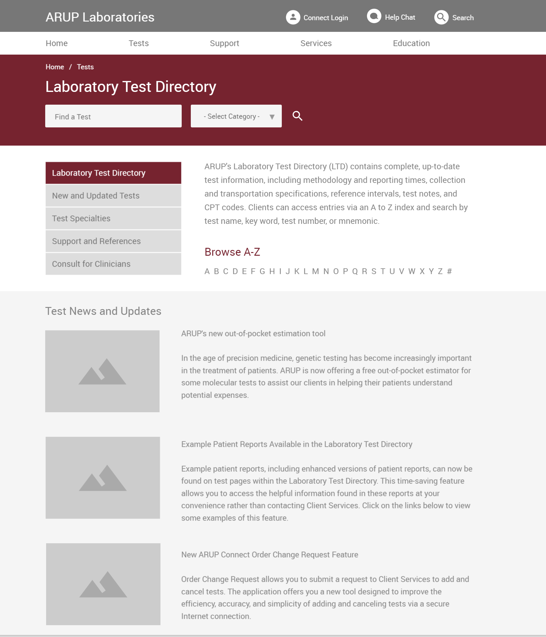
Among the top requests from customers was a better search experience. Given this feedback, I created hint text for the search box that animates upon page load to draw attention to the feature.
Heatmaps
This is the heatmap of how customers interacted with the website, comprising about a week of gathered data. Red and warmer colors indicate more frequent interactions, while blue and cooler colors show items that are less used.
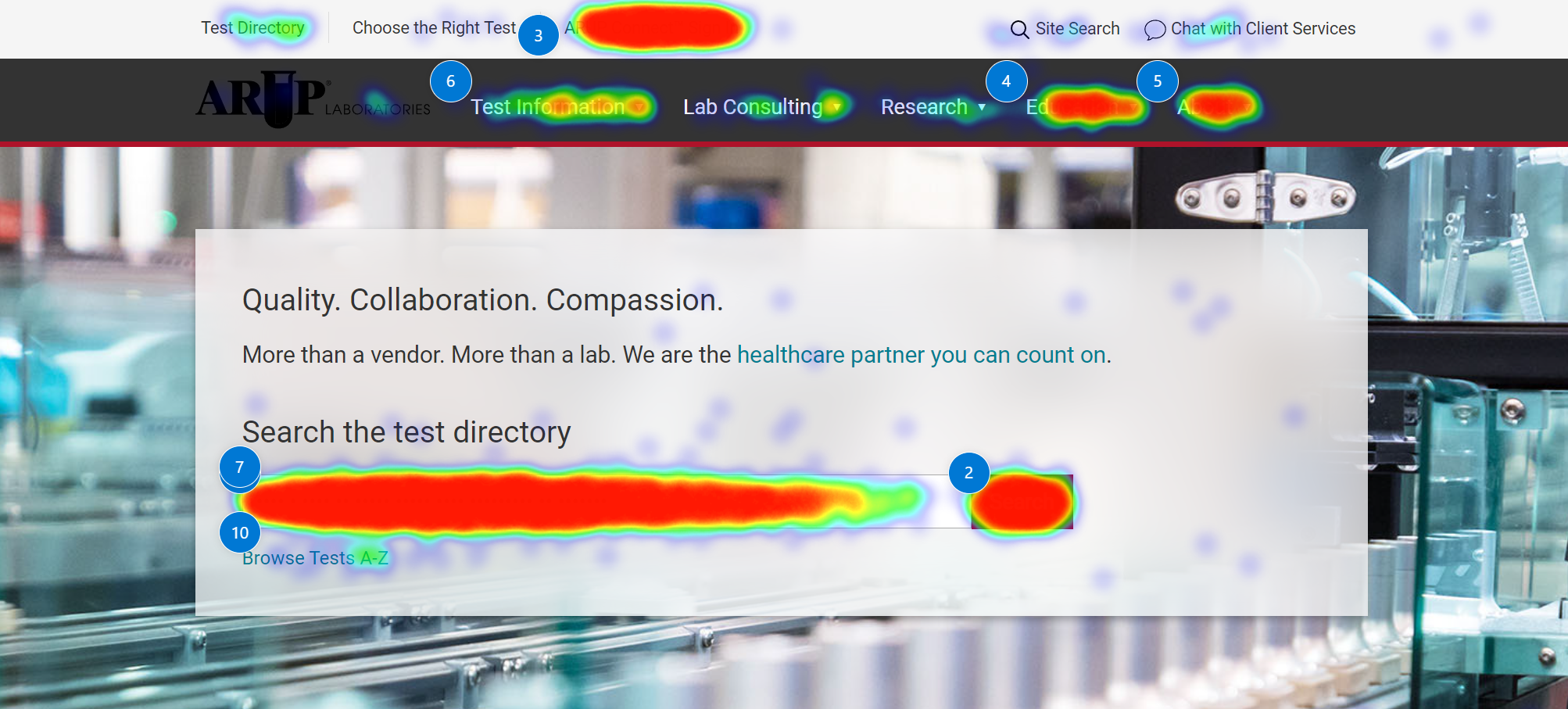
The mobile heatmap showed a similar pattern of what customers interacted with, and overall the data showed that customers were primarily searching the laboratory test menu.
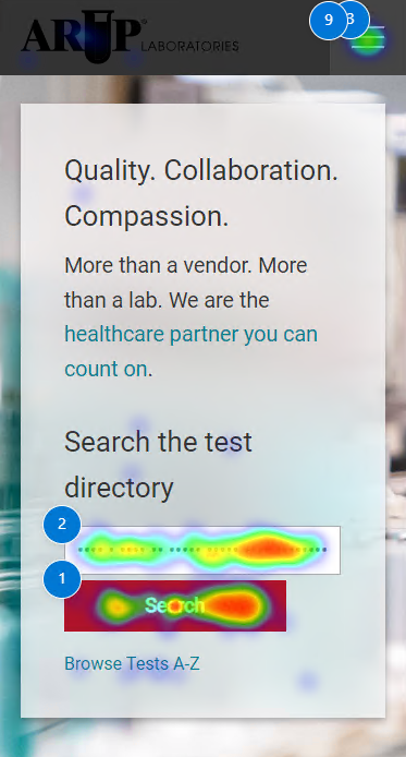
Because of metrics from session recordings, heat maps, analytics, and user interviews, I was confident that the new design performed well and helped customers get to what they want.
Delivery and Outcomes
The redesign of ARUP Laboratories’ main website was successfully completed in 2020. Positive outcomes of the redesign:
✓
Increased visual consistency across the entire site
✓
Improved navigation, resulting in 18.9% click through rate increase
✓
14% fewer calls to customer service for website-related issues