Case Study
Successes of the consulting services website redesign:
✓
Customers spent 12% more time on the landing page
✓
Average session duration and engagement increased by 42%
✓
Clearer call to action generated at least 20% more leads
Project Overview
Challenges
ARUP’s Healthcare Advisory Services is a consulting service for hospital laboratories and healthcare systems. The existing website had low engagement from potential and existing customers, and there was no clear call to action on the website for visitors.
Roles
→
User research and testing
→
Low and high fidelity prototypes
→
CSS, HTML, and JavaScript
→
Drupal CMS implementation
→
Post-launch analytics
Solutions
I collaborated with the director of marketing and consultants in Healthcare Advisory Services to understand the goals and needs of the project. I created a redesign of the website to promote service offerings and increase content engagement.
Design Process

Discover
- Conduct user research
- Background, market and competitor research
- Advocate for the users

Define
- Gather requirements
- Define scope
- Project timelines, technical feasibility

Design
- Sketch wireframes
- Low to mid fidelity prototypes
- High fidelity prototypes

Test
- Test for usability
- Gather qualitative and quantitative data
- Create design iterations

Deliver
- Handoff to developers
- Document design decisions
- Monitor outcomes
Discover
I participated in user research to find out what the users do, think, and feel as they go through the website. Many data points were gathered using quantitative analytics, qualitative input from customers, and vision from stakeholders. I considered both user needs and business objectives to create the most valuable and feasible solutions.
Methods
→
User interviews and surveys: meetings and focus groups
→
Web analytics: Google Analytics
→
A/B testing: Google Optimize
→
Heatmaps and screen recordings: CrazyEgg and Microsoft Clarity
Journey Map
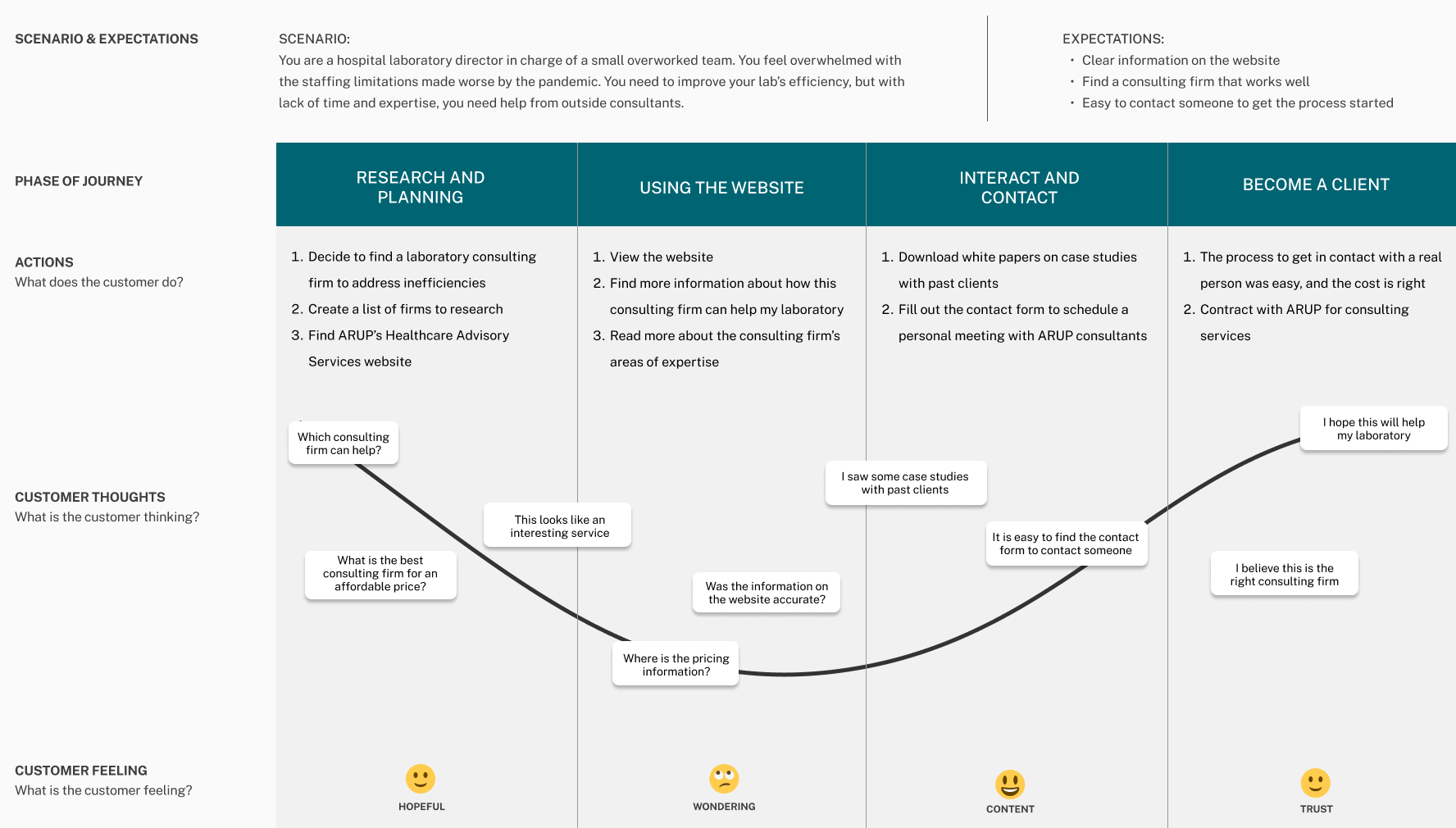
Potential customers can read case studies, download white papers, and sign up for a free initial consultation by filling out an online form. Customers are busy, so the form needs to be easy to find, so it’s easy for the customer to contact the consulting team to get the process started.
Define
Who are the users?
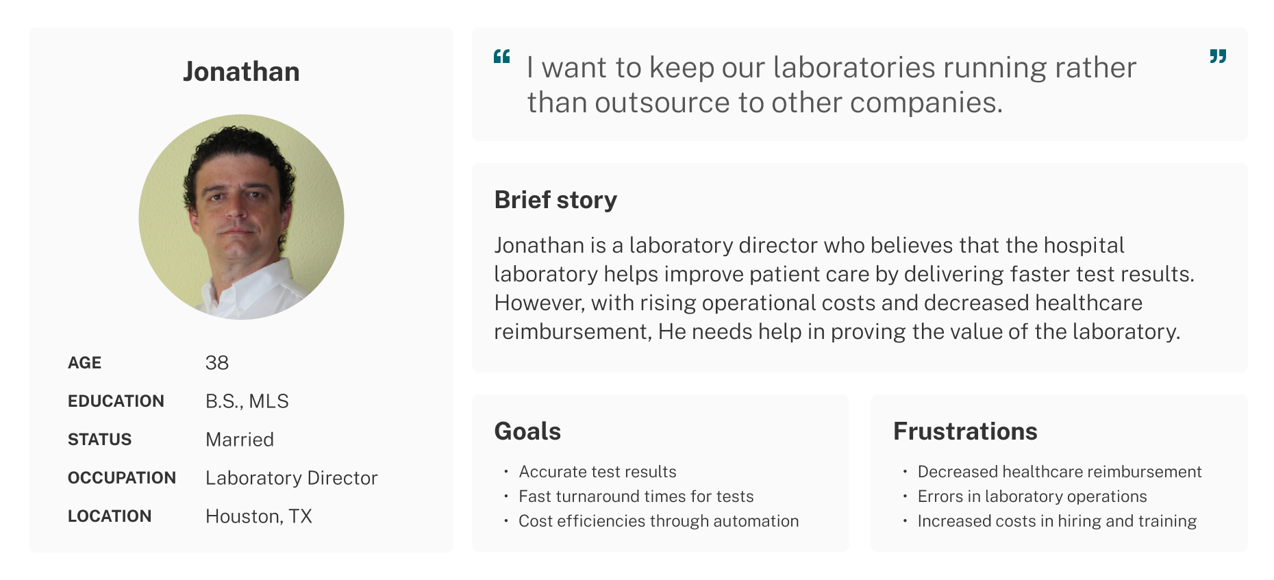
The primary users of the website are lab managers and directors who would be interested in consulting services for their labs. There are also C-level executives who want to understand what ARUP’s consulting services offers and how it expands potential partnerships.
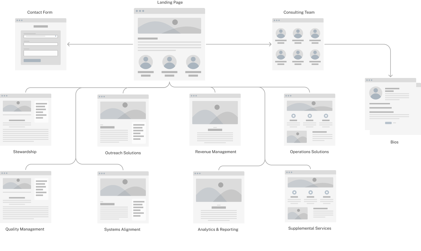
Proposed information architecture of the redesign
The website is an important tool to draw in potential customers, to help them better understand the services offered, and to bring them to the next step of conversion.
Design
I identified common pain points across different users and found unmet user needs. For example, there was no clear call to action button to become a client of ARUP’s Healthcare Advisory Services. I created design to addresses this and other issues uncovered in user research. The goals for the redesign were:
→
Promote Health Advisory Services offerings
→
Generate sales leads
→
Improve content engagement
→
Improve overall user experience
Accessibility
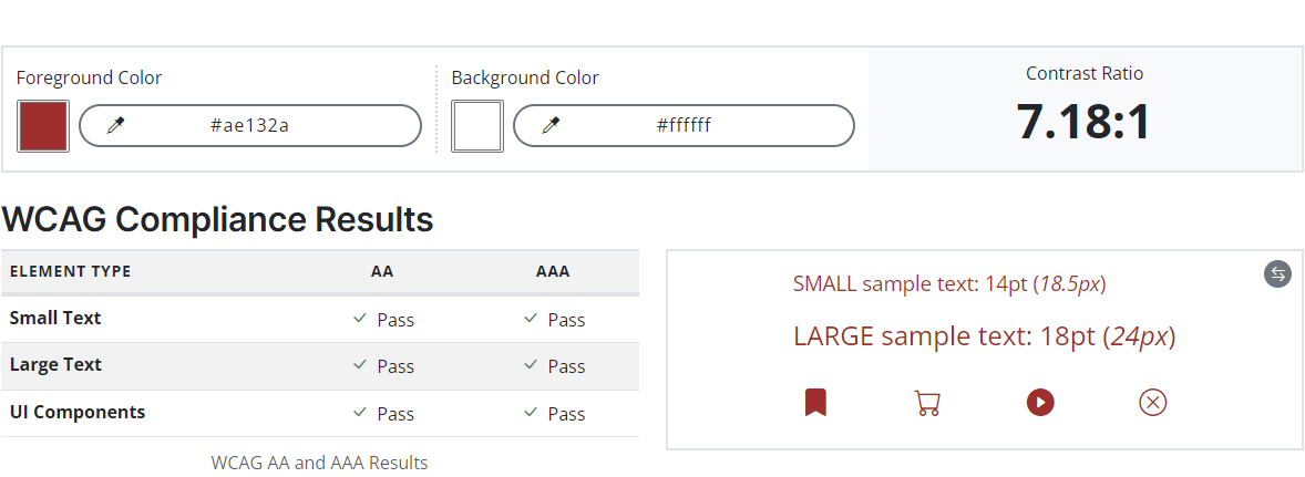
I designed according to Web Content Accessibility Guidelines, conducting accessibility checks on colors to ensure compliance. This is an example of the corporate brand color red on a white background.
Test
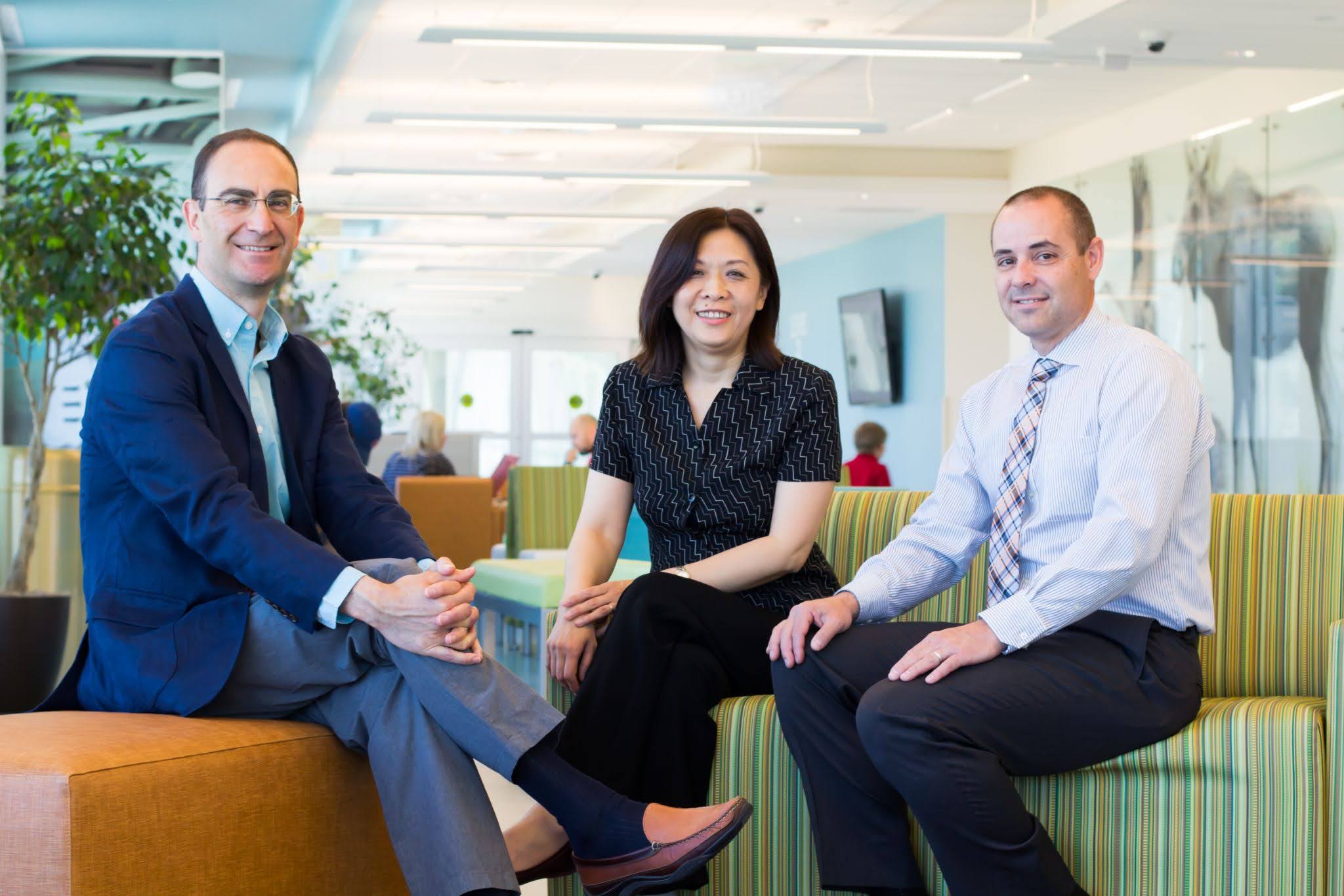
I tested high-fidelity designs with focus groups including medical directors and laboratory managers. I also gathered feedback from University of Utah Hospital and Primary Children’s Hospital executives.

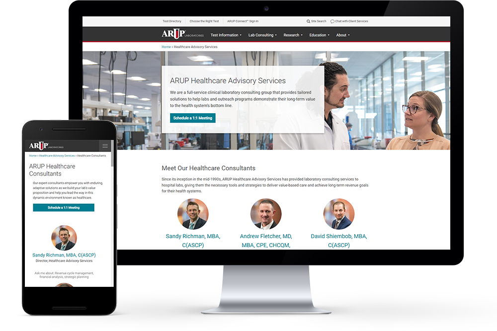
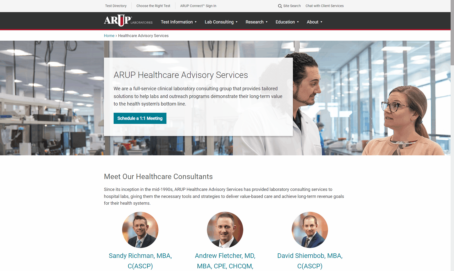
The main conversion goal is to drive potential customers to schedule a meeting with healthcare consultants. Healthcare executives and lab managers want to talk to a real person instead of reading through a lot of text. By putting prominent calls to action to schedule a 1:1 meeting for more information, the redesign met the goal to generate more consulting leads.
Delivery and Outcomes
The redesigned consulting services website was launched March 2022. Successes of the consulting services website redesign:
✓
Customers spent 12% more time on the landing page
✓
Average session duration and engagement increased by 42%
✓
Clearer call to action generated at least 20% more leads